With Framer you have access to an incredibly intuitive panel for managing effects and animations on your website. You can effortlessly add interactivity to your site, like text animations or visual effects triggered by a user clicking a button.
Framer offers a wide range of features to help you create dynamic and engaging user experiences. You can incorporate animated backgrounds, create parallax effects, and include interactive elements like dropdown menus or pop-up windows.
You can even customize the mouse cursor, as I explained in this article (How to create interactions and animations with the Cursor in Framer), to add a unique flair to your website. The possibilities are endless, limited only by your creativity.
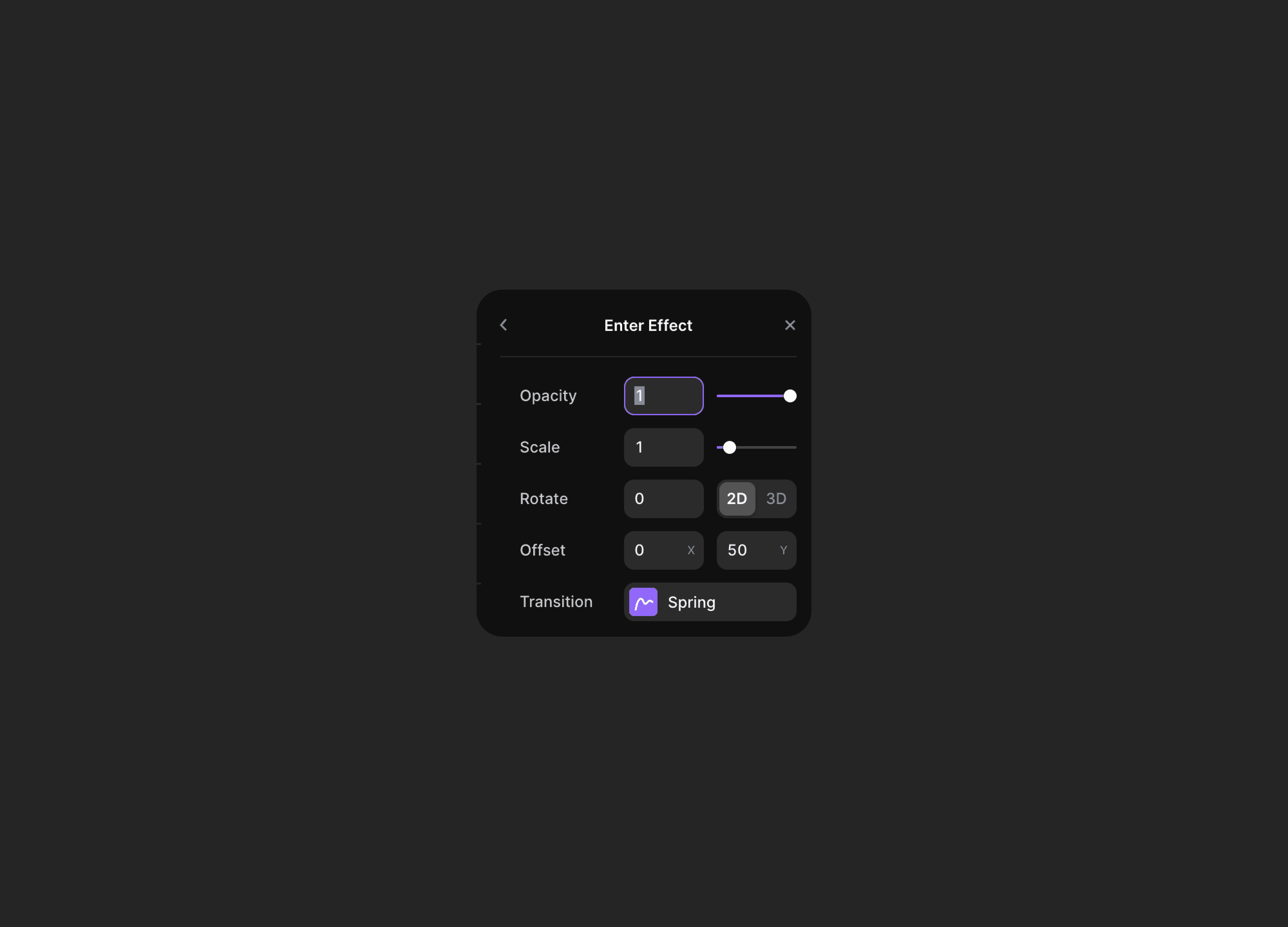
However, one crucial aspect to remember is that for an effect to integrate into your website, it needs to have the right timing, duration, positioning, and optimal offset.
Today, I'll share practical tips on how to become a master of effects and transitions in Framer.
No replay, pls
Framer supports the Replay feature, which allows you to repeat the effect you created whenever you return to the point where it was triggered. This feature applies to effects that start when you reach a certain section of the site or a visible layer.
The idea behind this is to show the visitor the effect again whenever they return to that specific point. From an experiential perspective, it is rewarding only for those who designed the site and added that effect. However, for all visitors, it can be quite frustrating as everything keeps disappearing and reappearing continuously.
Refreshing the page to restart most effects is more than sufficient. The only effects that need to repeat are the hover effects because it implies that hovering over an element indicates that we can select it. However, for example, a headline that appears doesn't need to reappear, especially if it's not clickable.
No fade, pls
The Fade Effect is like the simplest thing ever. It works in a really simple way, you have an element on the page that starts with opacity 0, invisible, and at some point, it goes back to 100, visible, ideally when it's in the center of the viewport, meaning the user has scrolled to that point.
It's the most well-known effect, you've probably used it, and no, it's not that great. It works, as long as you don't overdo it and make the Fade too long, otherwise, it will seem like the page is lagging, but it's nothing special.
It's just a fade, the simplest effect ever, and in a very long scrolling experience, it could be heavy and annoying, not to mention unambitious.
There are so many other entrance effects that have been explored, but honestly, the Fade is outdated. Sometimes it's essential for an element to fade, meaning it starts with opacity 0, and the only way to make it go to opacity 100 is with a Fade, but we always try to hide the effect, and let other effects take the lead.
Fade is "meh". Don't use it.
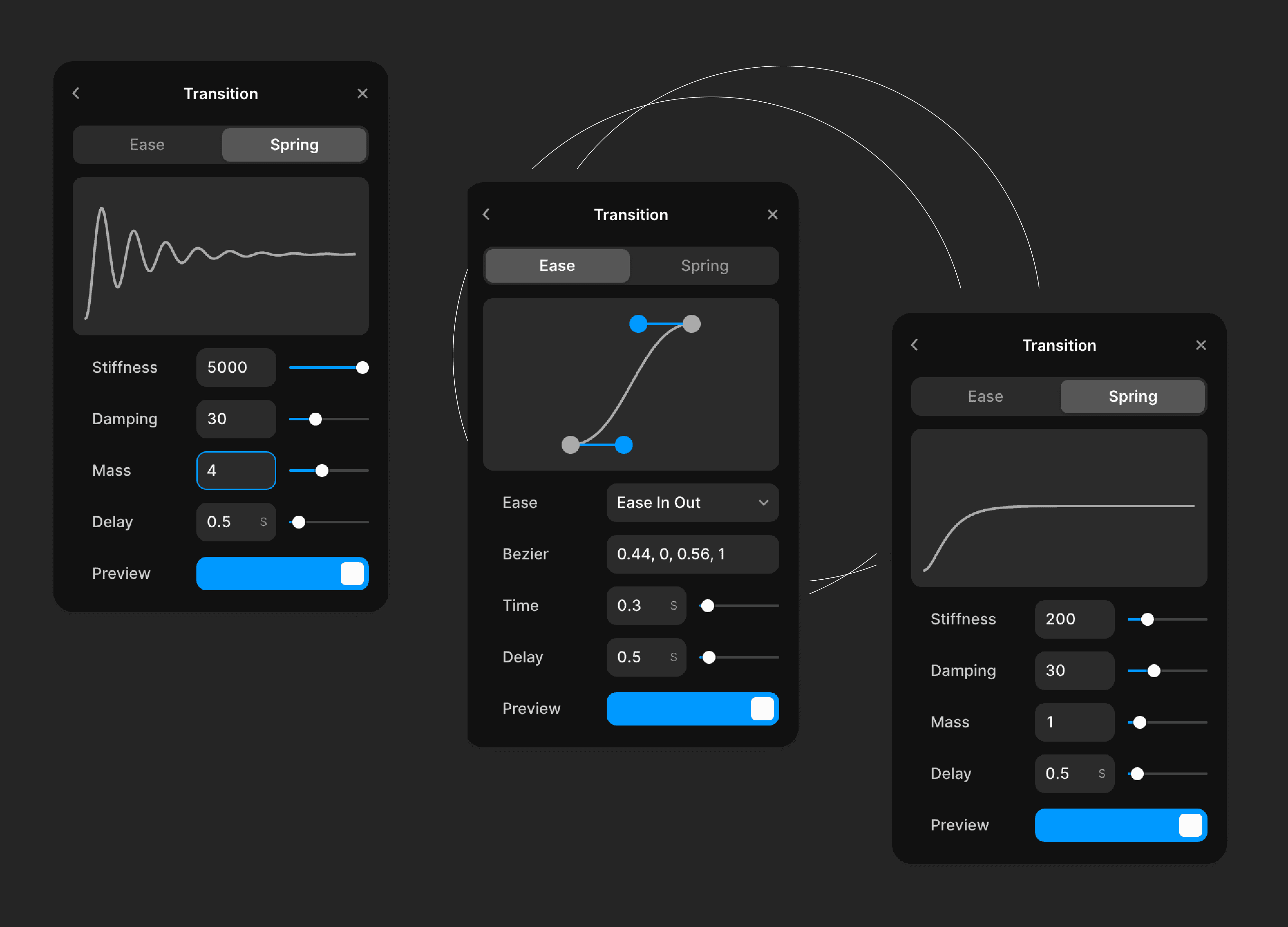
Ease the effect
When it comes to Framer's effects, there are various ways to start depending on the trigger we need. Whether it's on entry, on hover, or when reaching a certain point.
But regardless of the effect, what makes it spectacular is the easing. Easing is the most important aspect of any experience. Besides determining the duration of an animation, we also need to decide how it develops within the predetermined timeframe.
Without good easing, the effect will appear less smooth and natural. A good easing is crucial in creating a sense of dynamism and realism within an interface. Just try an effect without easing, and you'll notice it immediately: it will seem unnatural and unpleasant.
There are so many types of easing available that we can create endless variations for each effect. It's important to experiment with different combinations of duration and easing to find the best result for that effect because not all easings may work well.
For example, it could start slowly and end quickly, or vice versa. For all effects that start and then exit, the ease will naturally be the opposite, making the execution speed like a mirror image.
Here are a few examples of easing curves that I've often used.
Spring, an Ease apart
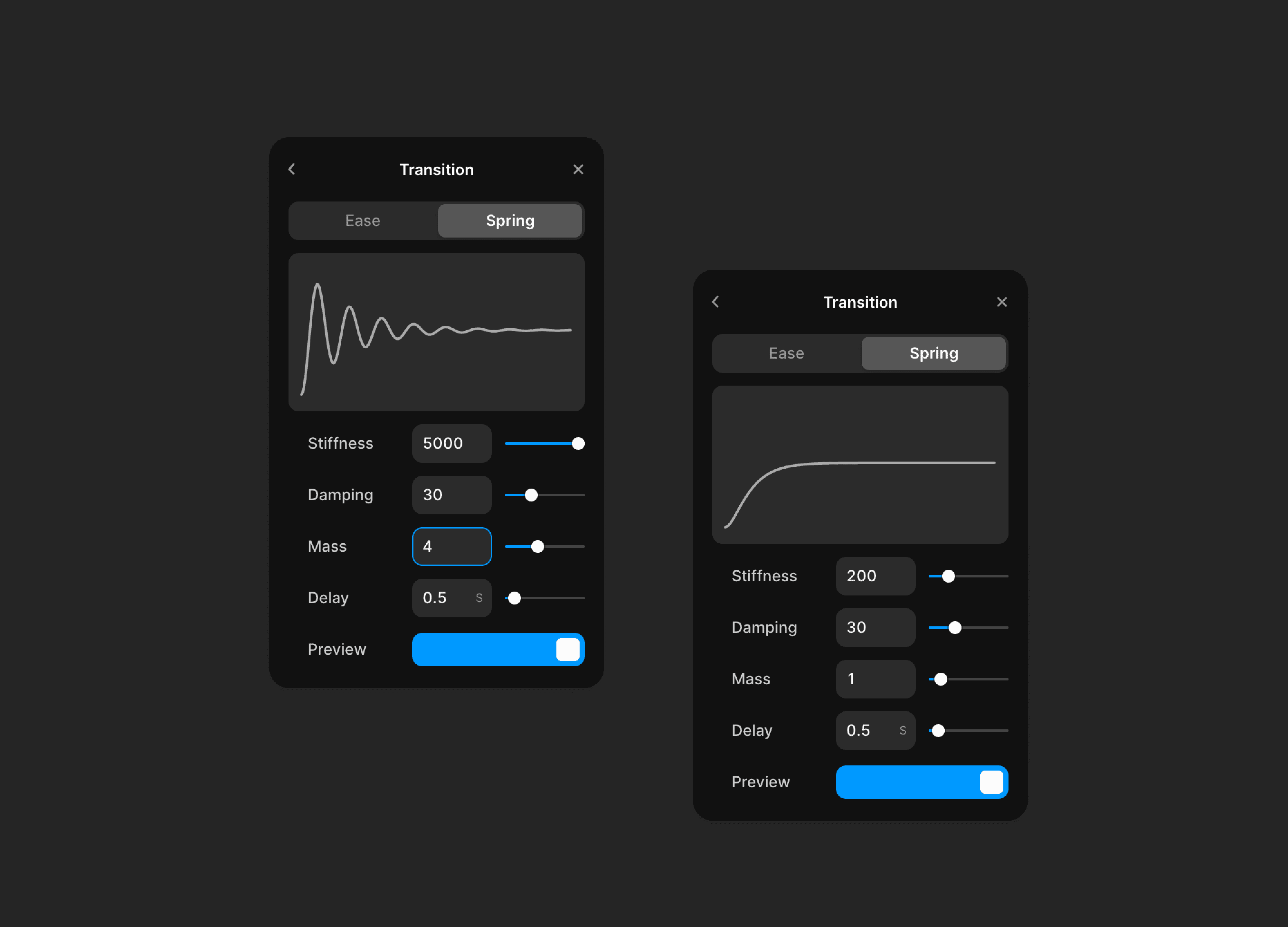
Spring, as the name suggests, is like a coil. The effect of using Spring is akin to a coil, especially when we increase the number of bounces, just like a coil can bounce multiple times.
Initially, I never thought I would ever use Spring because it seemed too cartoonish for my taste. However, there have been several occasions where I have used it, but in a very smooth manner, to create the illusion of an object being heavier than it actually is, as if it were hitting a surface.
Using Spring effectively requires practice and experimentation. It's not something to dismiss right away.
Consider Physics in Motion Design
If there's one thing that makes an animation on a website credible, it's its physics. The physics of a transition or an effect, any kind of effect, is the line between what's real and what's not.
If you feel like something is off when you scroll the page, that the effects are messy and have the wrong timing, it's all about physics.
For example, take two objects, a very large section and a small button. It's obvious that the button moves faster than the section. The section is heavy, the button is light. If you follow this concept, you'll realize that an entire section can't appear in 0.3 seconds and a button in twice the time, 0.6 seconds.
The bigger the object, the more time it will take to complete its transition from point A to point B, whether it's a hover animation or an appearance.
Let's take parallax as an example. The concept is very similar: the bigger an object, the more time it will take to move in space. If you want to create a believable parallax effect, you need to understand how big the elements in the scene are. To complicate things, you also need to decide who is in the foreground and who is in the background, and the farther an object is, the slower it will move.
Understanding physics, even on a simple producct like a website, is vital for a credible animation framework.
The tempo of animations, like in music
The last important aspect is the timing of animations. It's not just about the timing itself, but rather the identity you're giving to the page where the animations are present. It's clear that if you've chosen to create smooth and slow animations, you can't introduce them on a page that aims to convey speed and dynamism. Each animation should align with the purpose of the page it's placed in.
The timing of animations should be tailored to the device on which they will be viewed. For instance, a 1-second transition might be too slow on a mobile device but perfect on a larger screen.
In general, having a good grasp of timing in animations is important to convey a sense of fluidity and professionalism on your web page, as well as to maintain consistency and coherence within it. Just like in music, the rhythm of animations is fundamental in creating a pleasant and engaging user experience.
Avoiding mistakes with animation timing is crucial for a seamless user experience. One common error is inconsistency, where animations on the same page have different or conflicting speeds, creating a disjointed and confusing presentation. Another mistake is ignoring the user's interaction speed — animations should never feel like they're slowing down navigation or forcing the user to wait.
Overusing slow or elaborate animations may look impressive initially, but it can lead to frustration if it impedes the flow of information. Failing to test animations on various devices can result in poor performance on slower systems, leaving some users with a subpar experience.