Spacing and Spatial System in a Design System
Creating an effective layout is crucial to every outstanding design. Spacing, grids, and layouts establish guidelines that bring consistency to your designs, limit decision-making, and foster team alignment.

Riccardo Marconato
Jan 8, 2024

Crafting an effective layout is key to any great design. Using spatial arrangements, grids, and structures sets guidelines that keep your designs consistent, simplify decision-making, and promote team alignment.
Let’s dive into the basics of setting up spatial base units, establishing grid-based rules, and weaving them together to create modern UI layouts.
What is a spatial system?
A spatial system is all about the rules for measuring, sizing, and spacing your UI elements. Designers deal with spatial choices all the time, whether it's deciding on button sizes or the space around an icon. Keeping things consistent in terms of spacing helps your product stay coherent, makes team communication smoother, and cuts down on the number of decisions designers need to make. A popular example of a spatial system is the "8pt grid," but there are plenty of other options and setups out there.
Take a login form, for example—when it doesn't follow a clear spatial pattern, it can seem off, inconsistent, and untrustworthy to users. Having a predictable rhythm in design is not only more pleasing to the eye but also something users expect from brands they trust.
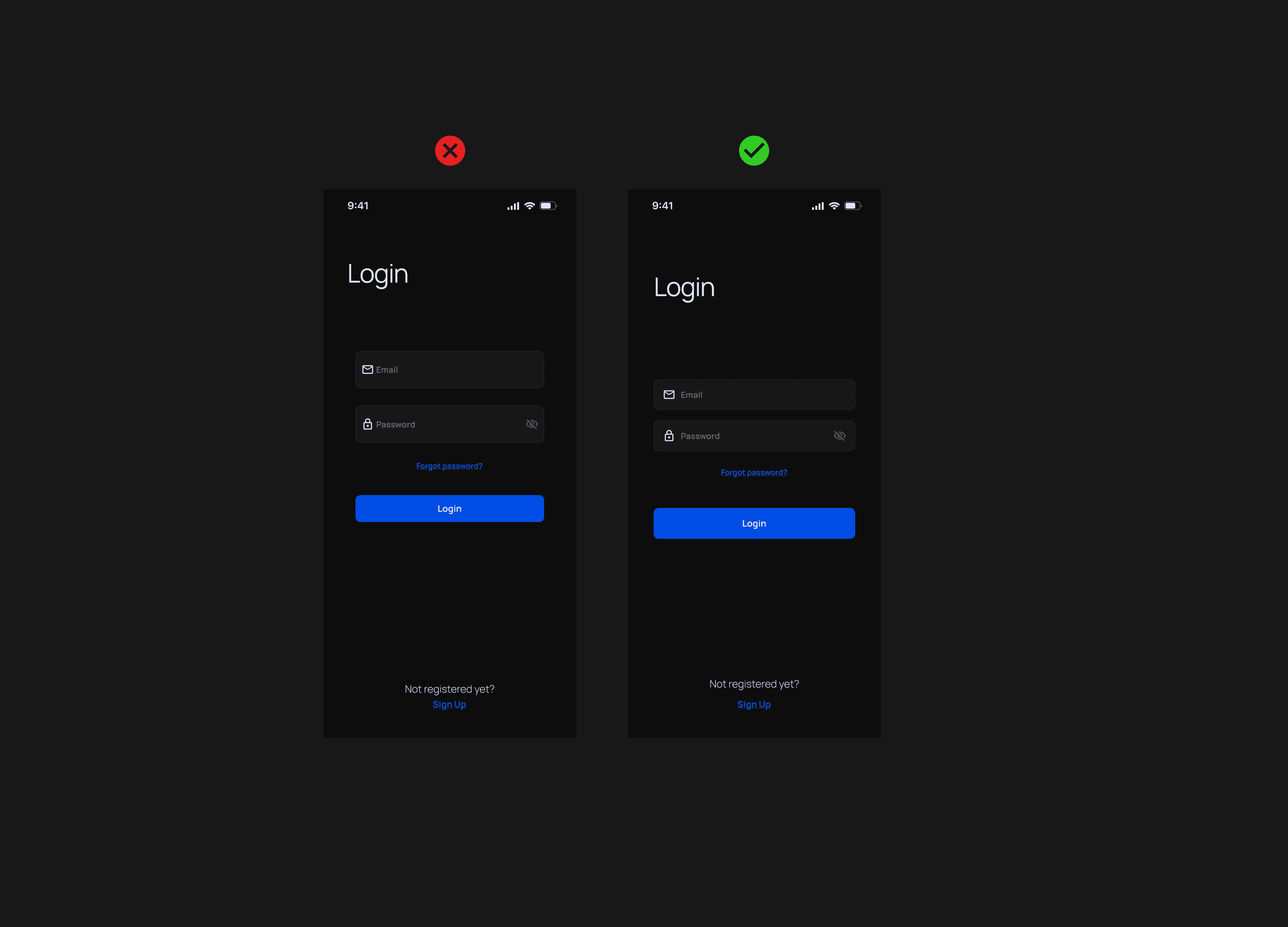
On the flip side, when the same login form follows an 8pt spatial system, everything feels more predictable and visually pleasing. Users enjoy a polished, consistent interface that builds trust and connection with the brand. No matter who tackles the design, a uniform spatial language ensures fewer decisions need to be made. Designers can easily continue from where others stopped or work alongside each other. Plus, since these choices are in the codebase, there's less time spent on manual annotations for engineers.
How do you start a spatial system?
Kicking off your spatial system with a defined base unit is key for creating a reliable scale of sizes. When browsing different products online, you'll see various methods—some go with 4pt, 5pt, 6pt, 8pt, or 10pt systems. There's no strict right or wrong choice, as long as you're aware of what each approach entails.
Personally, I'm a fan of an 8pt linear scale for elements, with a 4pt half step for spacing icons or small text blocks. For typography, I use a 4pt baseline grid, making sure the line-heights of my fonts divide evenly by 4. This setup is straightforward and reduces confusion.
When crafting your own spatial system, keep it practical and tailored to your needs. Here's what you should consider:
Keep your users in mind
When designing your UI, think about your users and the brand vibe you want to convey. Decide if you prefer a spacious UI with big fonts and few actions, or if you need to cater to tech-savvy users with detailed data tables and multiple actions.
Take a look at your current designs and create a mood board to get clarity and alignment for you and your team. This process helps ensure your design decisions are thoughtful and match your design goals.
Steer clear of tiny units
Choosing smaller base units like 4pt, 5pt, or 6pt can add too many variables to your system. It can be tough to visually tell the difference between 12pt and 16pt padding, which complicates consistency within a team. From my experience, using 8pt increments strikes a nice balance between visual clarity and variable management. Plus, I use a half unit of 4pts for spacing icons or adjusting small text blocks.
Avoid odd numbers
Incorporating odd numbers, like a 5pt base, in spatial rules can make centering elements without pixel splitting a hassle. Take a 25px height button where text and icons are centered; this might lead to blurry split pixels for some users. Similarly, using a 1.5x scale for different mobile and desktop screens can also cause pixel fuzziness.
How do I apply a spatial system?
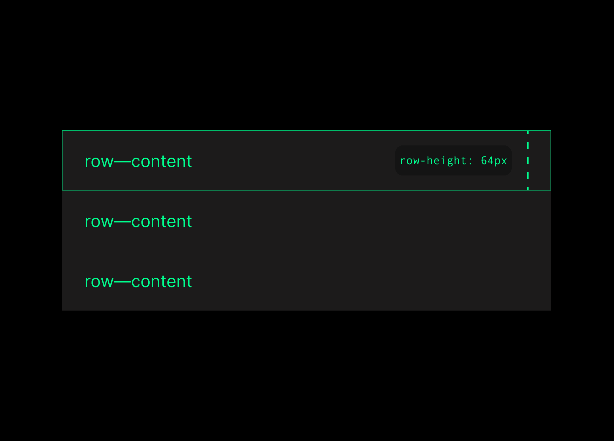
To apply the spatial scale to your UI elements, use padding, margin, height, and width settings. These help you control the spacing and size of your elements. But there might be times when certain padding rules clash with keeping a strict height.
For example, if a text's line-height is set to 20px and you add an 8px top and bottom padding, the button's height will bump up to 36px. This raises the question of which measurement should take priority. In such cases, you have a couple of ways to tackle this issue.
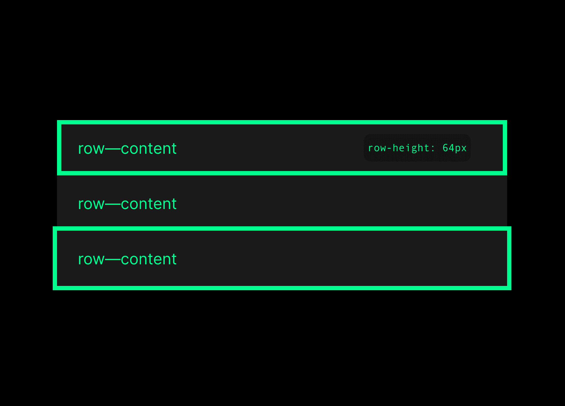
Strict element sizing
I prioritize sizing solid elements to align with your predetermined spatial system. This ensures consistency and establishes a rhythmic flow in the overall composition.
Key elements like buttons and form inputs receive special attention as they often contain predictable content. By focusing on these elements, I create a harmonious design that enhances user experience.
Strict internal padding
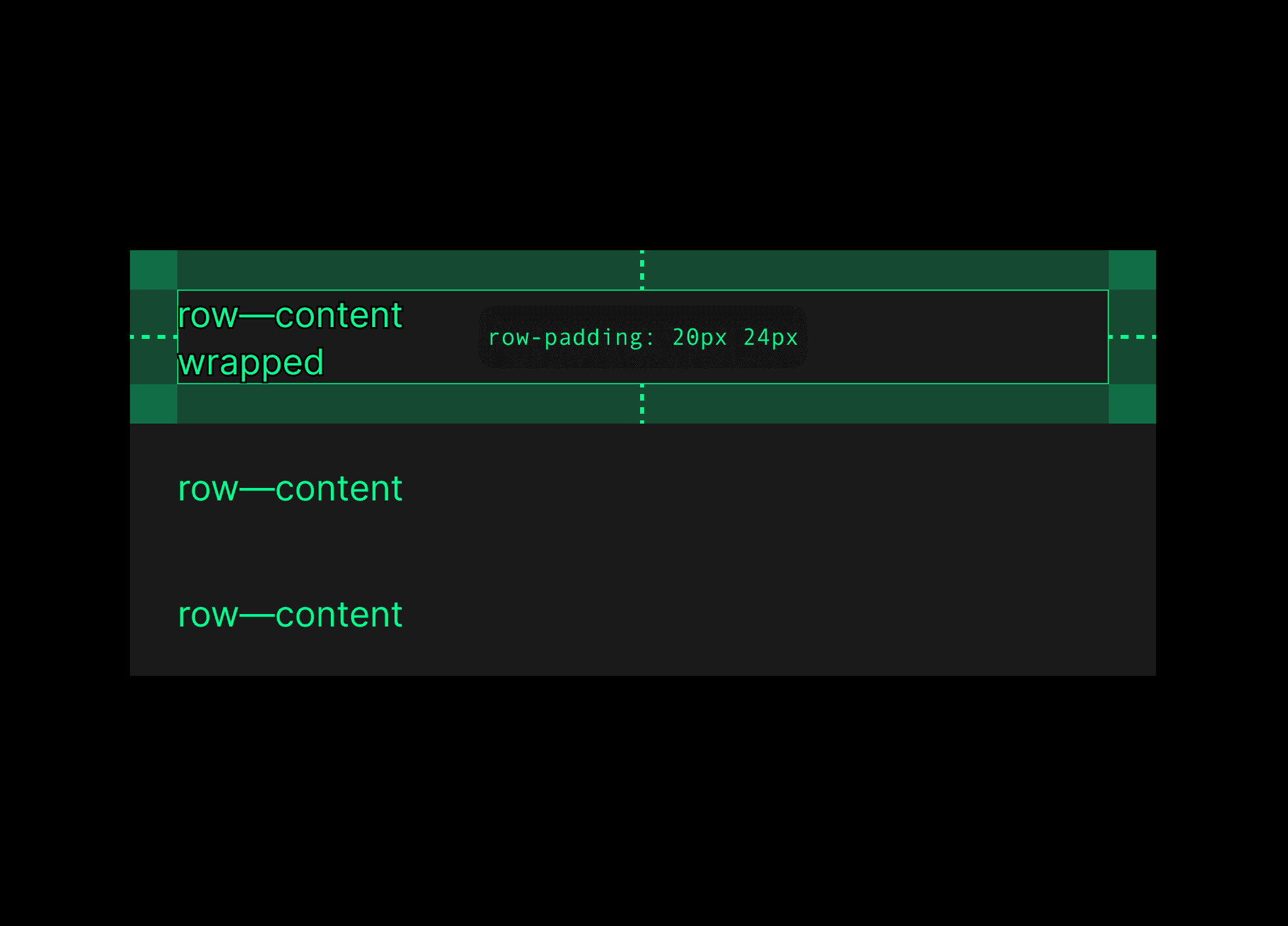
Handling unpredictable content and deciding how to display it means you need to apply strict padding inside and let the content dictate the size of the elements. While these sizes should still stick to your spatial system rules, the spacing around the content comes first. This approach works well for tables with user-generated content of different lengths.
Border placement inside or outside
When dealing with outlined elements like buttons or cards, things can get a bit tricky. How do I handle that 2px border? The way I count it in code might not match what I see in Figma. So, which one should be my go-to? In Figma, the measurement excludes the border, focusing on the element itself.
But on the web, it works differently. Developers use the "box-sizing" property, which can be set to "border-box" or "content-box". Basically, most of the modern web leans toward the "border-box" method. I can make the code pixel-perfect, but that might complicate things if the team isn't on the same wavelength. It's important to chat with the team to define the approach and make sure everyone's aligned.
Keeping open communication and alignment within the team is key to maintaining consistency and smoothly integrating design principles into our development practices. It's this synergy that allows us to craft intuitive and engaging digital experiences that really connect with users.

Riccardo Marconato
I design high-end digital experiences and visual design for the crypto/Web3, AI, and tech industries.


