Figma, Framer, and Webflow can be combined to swiftly create captivating websites. The Figma to HTML with Framer Plugin allows seamless transition from Figma design to Framer with just one click. But how should we prepare the file for Framer? How can we optimize this process? Let's explore together.
How Framer's responsive breakpoints work
Framer utilizes the following breakpoints by default:
Desktop: 1200px
Tablet: 810px
Mobile: 390px
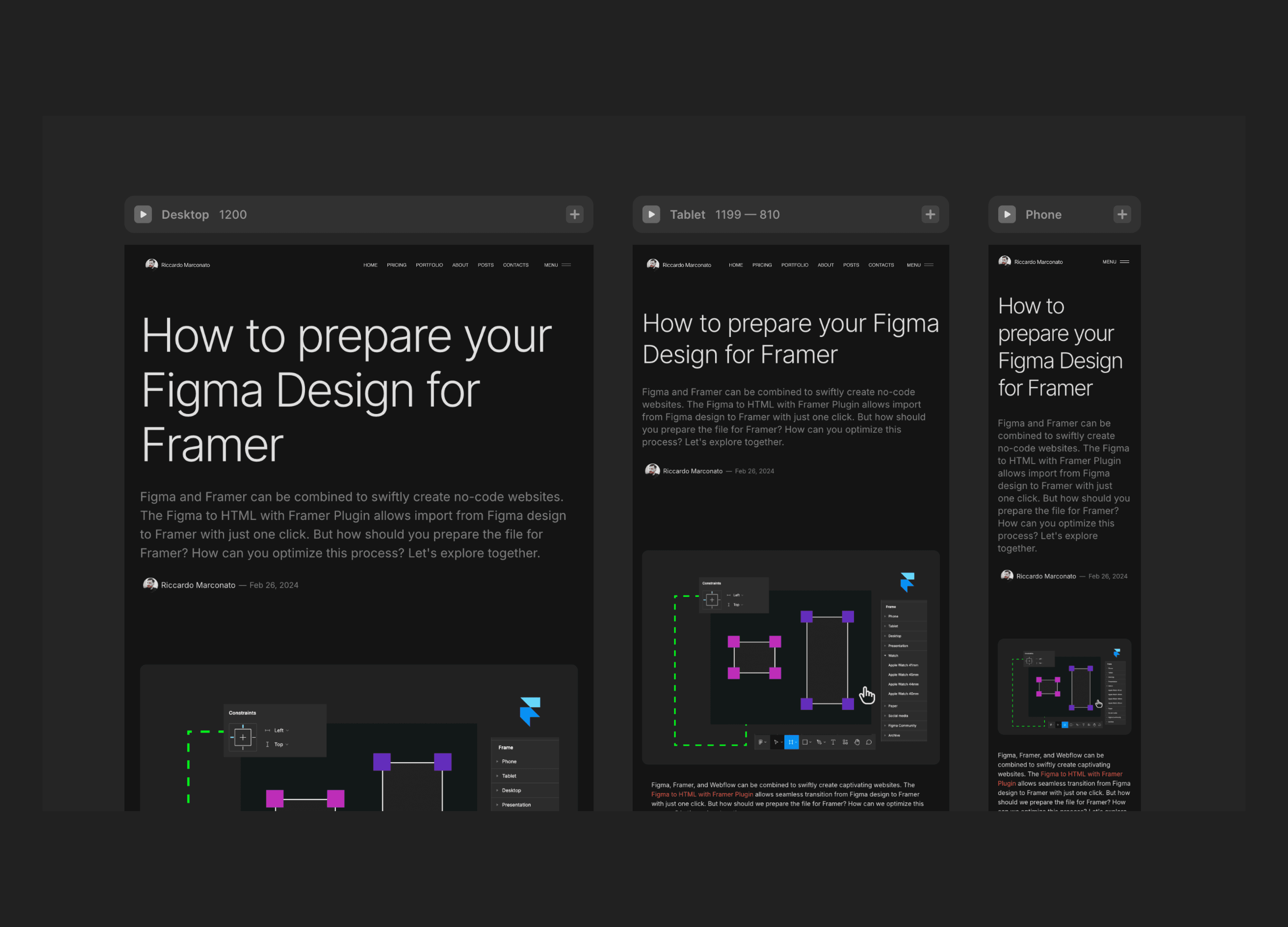
This means that the Desktop covers everything from 1200px and above, Tablet spans from 1199px to 810px, and Mobile includes anything below 809px. We can tweak the breakpoints, add more, but 3 breakpoints are enough for now.
In Figma, we draw on a page with a fixed width (or "hug" based on content). In Framer, we need to define how the website will adapt from a large screen to a mobile device or viceversa.
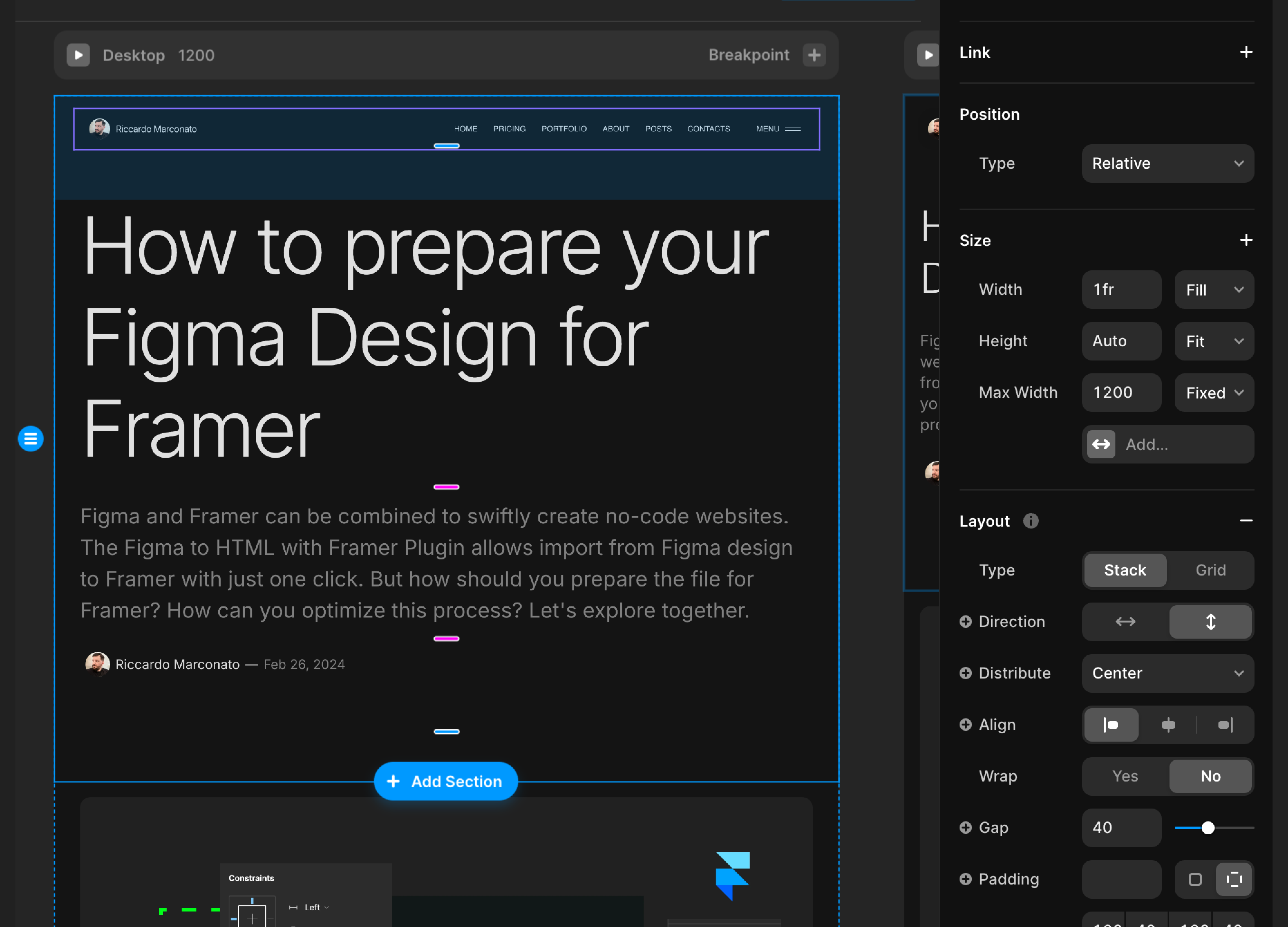
The simplest thing with Framer and Web Design in general is to set a central container 1200px wide where you place your entire design. Then, if the screen is larger, your content remains centered with a maximum width of 1200px. In Framer you can also increase the width of the container by setting a higher Max Width to every section within.
That's what we'll do. I think there are better ways to handle larger screens, such as adding some responsive breakpoints above 1200px or using a fluid design, but I'll cover this in another article.
Design on a frame 1200px wide in Figma
The best way to prepare your Figma design for importing it into Framer is to draw on a 1200px wide frame, which corresponds to the Desktop version.
Desktop ranges from 1200px and above. If you've designed on 1440px, for example, it's actually fine, but you'll need to do some extra work on Framer, which I'll explain in another article.
Design with autolayout in Figma
Design with autolayout to optimize the layout for Framer. Though we have 3 base breakpoints, they won't fit every screen size from Desktop to Mobile. Even with 20 more breakpoints, it wouldn't cover all scenarios, leading to extra and unnecessary work.
This article thoroughly explains the advantages of designing with autolayout: shoul I always use autolayout?
When working with Framer as a website, I recommend using the padding of each section to determine the spacing.
Within the 1200px frame, there will be different sections like hero, content, footer, etc. Each section should have its own vertical and horizontal padding. For the main container, keep padding and gap at 0, and adjust the padding and gap for each section as needed.
Sections will fill the container available space inside the main container, that is 100% at this stage.
It's important to note that the main container doesn't have any padding. This allows us the flexibility to adjust padding and gap specifications for each section individually or add a background image without being limited to the same settings. Being more flexible in this way is preferable to avoid constraints.
I discussed this approach here: Design System and Spacing
Should I design responsive on Figma?
You can do it if you like. I always do.
Just to let you know, we won't be using responsive designs when importing the Figma design into Framer. In Framer, whatever you design on the main page (Desktop, default) will also show on the other breakpoints, where you can then make modifications as needed. We'll explore this further in the next article.
This way, there's no need to design for both tablet and mobile (or Desktop and tablet if you used a mobile-first approach) because we'll only import one of the breakpoints.
The Figma Design
Width of 1200px, fixed
Height set to "hug content"
Vertical autolayout with 0 padding and 0 gap
Includes sections (frames) that have their own padding and gaps