Brevo Website
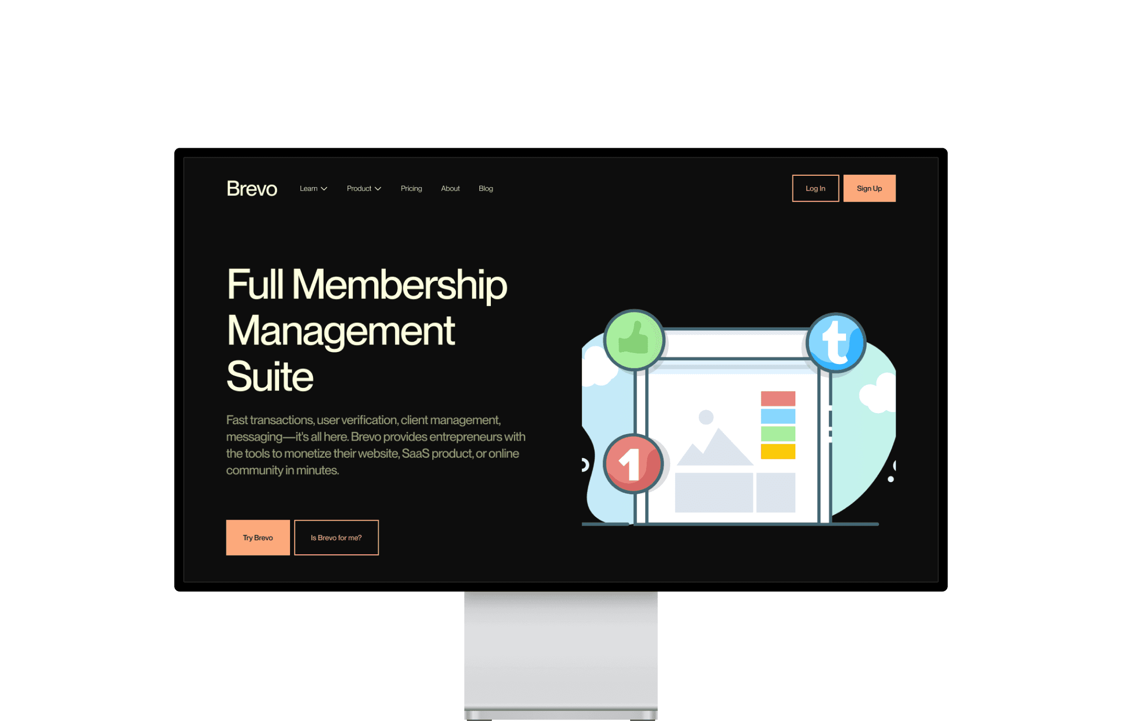
Brevo is a full membership management suite. Fast transactions, user verification, client management, messaging—all in one place. I worked on the website and the product design of the entire Brevo ecosystem, focusing on innovative design and seamless user experience to enhance their digital presence.
01
Font Family
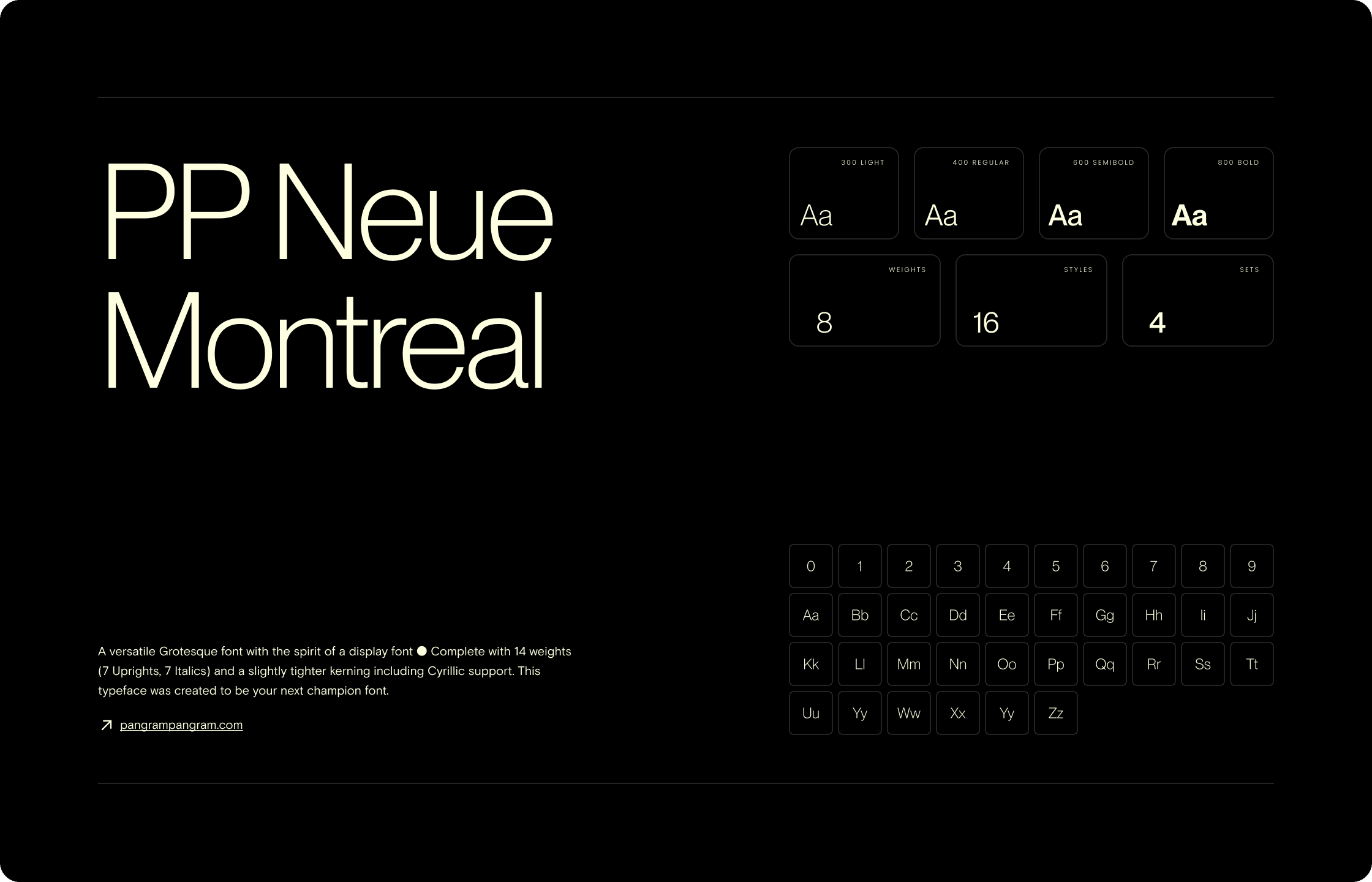
For the Brevo website, I selected the PP Neue Montreal font family. PP Neue Montreal is a versatile typeface with a modern and clean aesthetic, offering a wide range of weights and styles to suit various design needs. Its geometric sans-serif form provides excellent readability and a contemporary look that complements the dynamic nature of Brevo's branding.
01
Font Family
For the Brevo website, I selected the PP Neue Montreal font family. PP Neue Montreal is a versatile typeface with a modern and clean aesthetic, offering a wide range of weights and styles to suit various design needs. Its geometric sans-serif form provides excellent readability and a contemporary look that complements the dynamic nature of Brevo's branding.
02
Colors
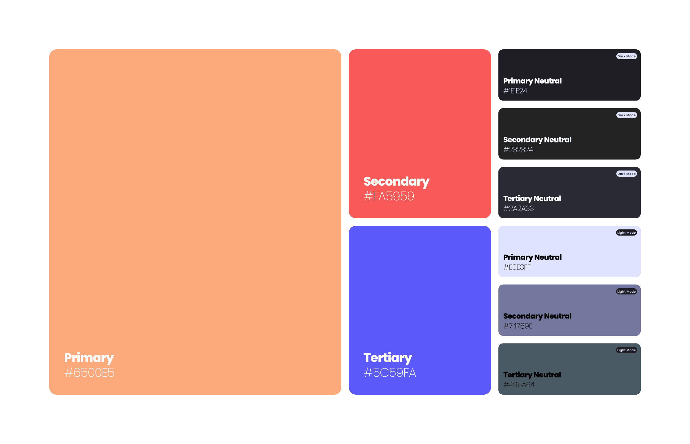
For the Brevo website, I chose a vibrant color palette to reflect the company's dynamic and energetic brand identity. The primary color, #6500E5, is a bold purple that conveys creativity and innovation. The secondary color, #FA5959, is a striking red that symbolizes enthusiasm and excitement. The tertiary color, #5C59FA, is a fresh blue that represents growth and success. This combination of colors creates a visually engaging and memorable user experience.
01
Colors
For the Brevo website, I chose a vibrant color palette to reflect the company's dynamic and energetic brand identity. The primary color, #6500E5, is a bold purple that conveys creativity and innovation. The secondary color, #FA5959, is a striking red that symbolizes enthusiasm and excitement. The tertiary color, #5C59FA, is a fresh blue that represents growth and success. This combination of colors creates a visually engaging and memorable user experience.
02
Colors
For the Brevo website, I chose a vibrant color palette to reflect the company's dynamic and energetic brand identity. The primary color, #6500E5, is a bold purple that conveys creativity and innovation. The secondary color, #FA5959, is a striking red that symbolizes enthusiasm and excitement. The tertiary color, #5C59FA, is a fresh blue that represents growth and success. This combination of colors creates a visually engaging and memorable user experience.
03
Responsive Design
Adaptive Sizing
To ensure the Brevo website looks great on all devices, I implemented a responsive design strategy. The layout adapts seamlessly to various screen sizes, from desktops and tablets to mobile phones, providing an optimal user experience regardless of the device.
Flexible Padding and Margin
I applied a flexible approach to padding and margins for Brevo, scaling these elements to suit different screen dimensions. This adaptive method ensures that the website's content is well-spaced and aesthetically pleasing whether viewed on a large desktop screen or a small mobile device.
Scalable Typography
The typography system for Brevo is designed to be scalable, with font sizes, letter spacing, line heights, and paragraph spacing adjusted for each device. This ensures that text remains readable and visually appealing across all screen sizes, enhancing the overall user experience and maintaining design consistency.
01
Responsive Design
Adaptive Sizing
To ensure the Brevo website looks great on all devices, I implemented a responsive design strategy. The layout adapts seamlessly to various screen sizes, from desktops and tablets to mobile phones, providing an optimal user experience regardless of the device.
Flexible Padding and Margin
I applied a flexible approach to padding and margins for Brevo, scaling these elements to suit different screen dimensions. This adaptive method ensures that the website's content is well-spaced and aesthetically pleasing whether viewed on a large desktop screen or a small mobile device.
Scalable Typography
The typography system for Brevo is designed to be scalable, with font sizes, letter spacing, line heights, and paragraph spacing adjusted for each device. This ensures that text remains readable and visually appealing across all screen sizes, enhancing the overall user experience and maintaining design consistency.
03
Responsive Design
Adaptive Sizing
To ensure the Brevo website looks great on all devices, I implemented a responsive design strategy. The layout adapts seamlessly to various screen sizes, from desktops and tablets to mobile phones, providing an optimal user experience regardless of the device.
Flexible Padding and Margin
I applied a flexible approach to padding and margins for Brevo, scaling these elements to suit different screen dimensions. This adaptive method ensures that the website's content is well-spaced and aesthetically pleasing whether viewed on a large desktop screen or a small mobile device.
Scalable Typography
The typography system for Brevo is designed to be scalable, with font sizes, letter spacing, line heights, and paragraph spacing adjusted for each device. This ensures that text remains readable and visually appealing across all screen sizes, enhancing the overall user experience and maintaining design consistency.

Nice things people say
"Using his Design System and ready Figma components it's heaven for teammates. I would recommend him to anybody."

Alina Prigotska
Senior UX/UI Designer
at

Unity
“Riccardo is a talented an passionate designer, and I can't praise enough him for his methodical work”

Stefano Bartoletti
Freelancer
at

stefanobartoletti.it
"Riccardo's attention to tiny details and ability to communicate design principles made our working process seamless and pleasant 🦄 "

Mayah Arutinova
Freelancer
at

Toptal
"He's not only easy to collaborate with but also ensures his designs are well-structured and logically constructed. "

Tanya Matyushenko
Webflow Expert and Developer
at

Upwork
"Riccardo is very attentive, and his work with the design system is fantastic. He knows how to explain and teach."

Inna Ramashko
Lead UI Designer
at

Calidat
Got a project in mind? Let's talk :)
©2023 — 2024
Nice things people say
"Using his Design System and ready Figma components it's heaven for teammates. I would recommend him to anybody."
Alina Prigotska
Senior UX/UI Designer
at
Unity
“Riccardo is a talented an passionate designer, and I can't praise enough him for his methodical work”
Stefano Bartoletti
Freelancer
at
stefanobartoletti.it
"Riccardo's attention to tiny details and ability to communicate design principles made our working process seamless and pleasant 🦄 "
Mayah Arutinova
Freelancer
at
Toptal
"He's not only easy to collaborate with but also ensures his designs are well-structured and logically constructed. "
Tanya Matyushenko
Webflow Expert and Developer
at
Upwork
"Riccardo is very attentive, and his work with the design system is fantastic. He knows how to explain and teach."
Inna Ramashko
Lead UI Designer
at
Calidat